Redesign of the Sobersauce Mobile Experience

Sober Sauce Header Image

Problem Statement

Sobersauce is an eCommerce refreshment company that sells and delivers a range of low-alcohol or alcohol-free beverages. However...

...analytics data revealed a high cart abandonment rate, negatively impacting sales.


Proposed Solutions

1. Clarify the purpose of each webpage

  • Improve way-finding by using hierarchy
  • Categorise products to improve findability
  • Implement ‘sort’ and ‘filter’ functionality
  • 2. Streamline the purchase process

  • Remove duplicate data entry at check-out
  • Minimise navigation by using popovers
  • Identify progress using breadcrumb trails

  • Research Method 1: Comparing Existing Website Structure and Analytics Data

    Low findability resulted in high interaction costs.

    The existing website structure did not categorise products to make them easily findable. 19 separate product list pages had conflicting titles, e.g.:
  • 0.0%ABV Alcohol Free Beers
  • Alcohol Free Dark Beers
  • Alcohol Free IPAs
  • Non-Alcohol Pale Ales
  • Low findability inferred extra user navigation steps, resulting in high interaction costs. Analytics data observed a high drop-off rate.

    Site Structure Diagram of the Sober Sauce Website

    Research Method 2: Journey Mapping

    Feelings of impatience and frustration were experienced at check-out.

    User interviews and walkthroughs revealed pain points in the browsing and checkout processes. Users reported feeling confused, lost, or irritated by the browsing process, corroborating earlier research data.

    Key opportunities identified:
  • Combine product categories to reduce conflicts. Use 'sort' and 'filter' functionalities for findability.
  • Remove duplicate check-out information requests. Combine steps where appropriate.
  • Signpost product information. Show when requested.
  • Enable users to add products to baskets with minimal further page navigation steps.
  • Journey Mapping Task Document


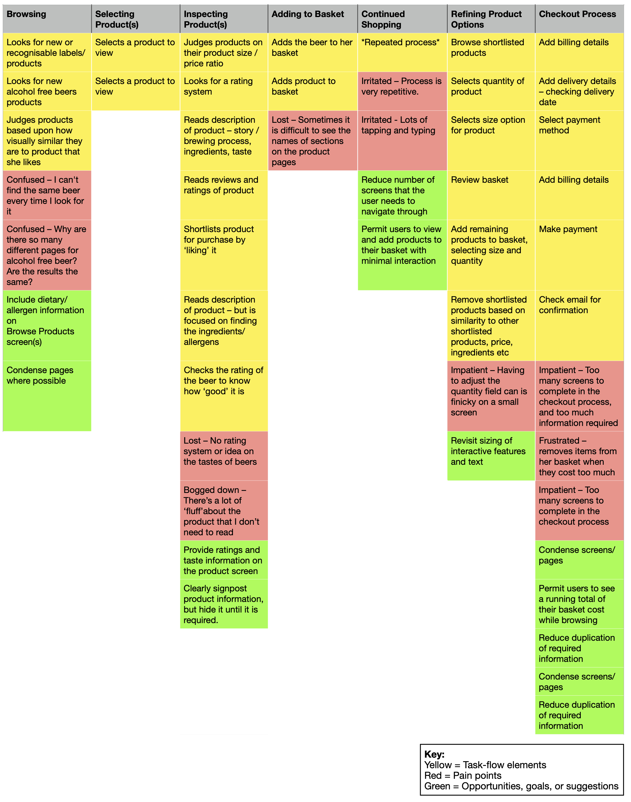
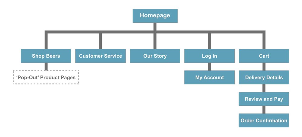
    Redesigned Site Structure

    A redesigned site structure minimised steps within the purchase task flow.

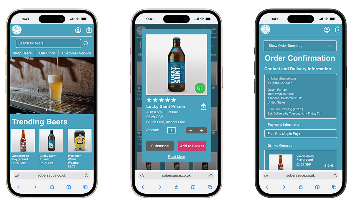
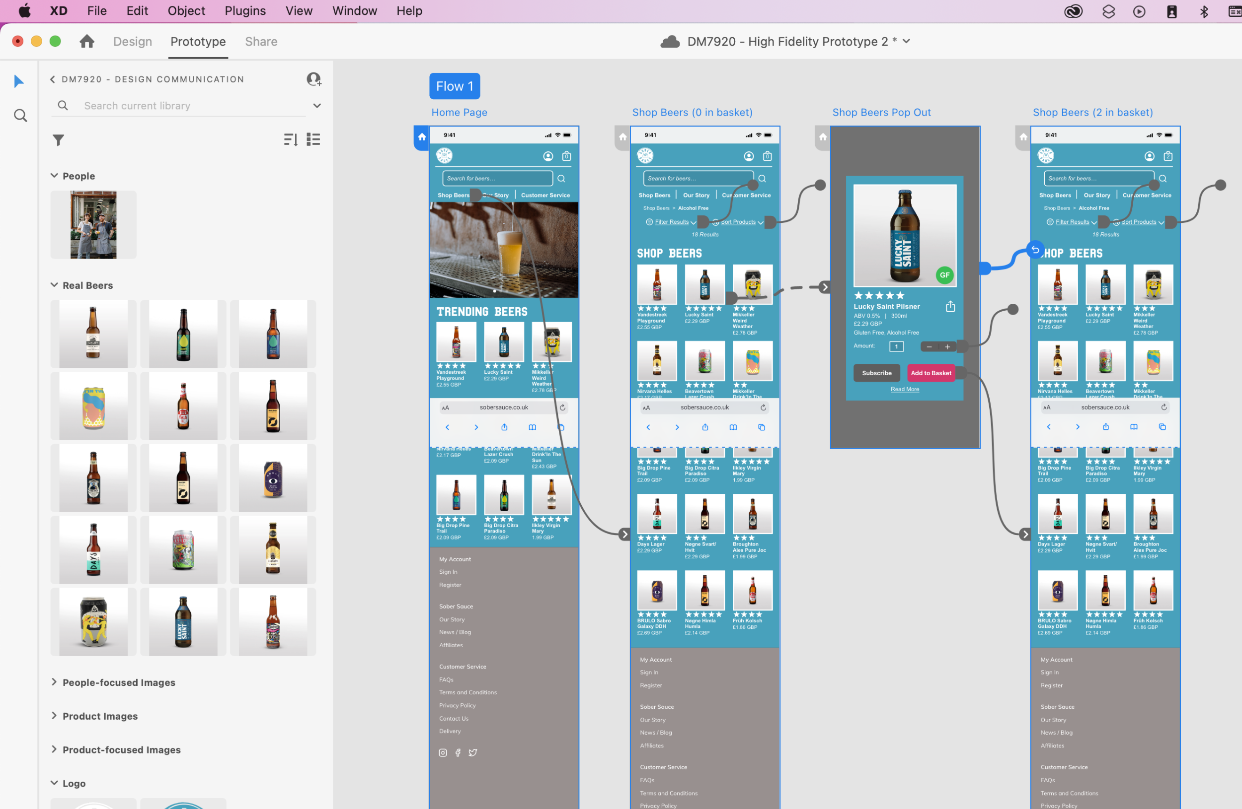
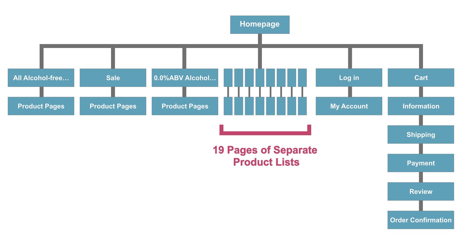
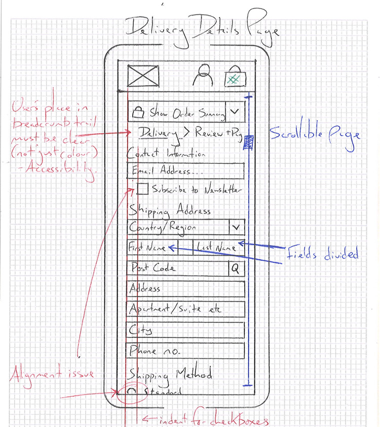
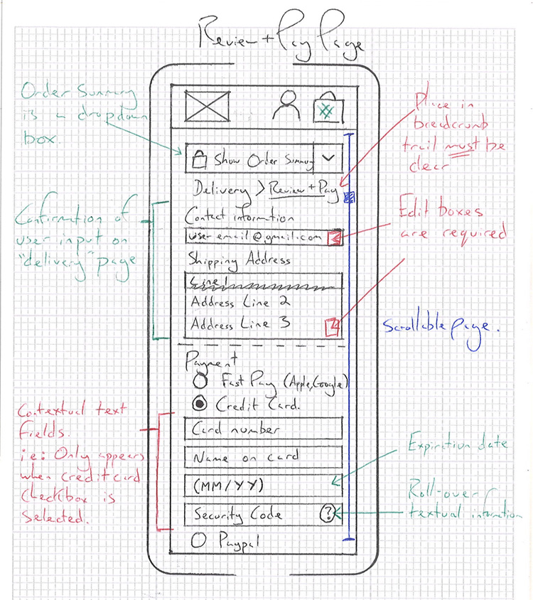
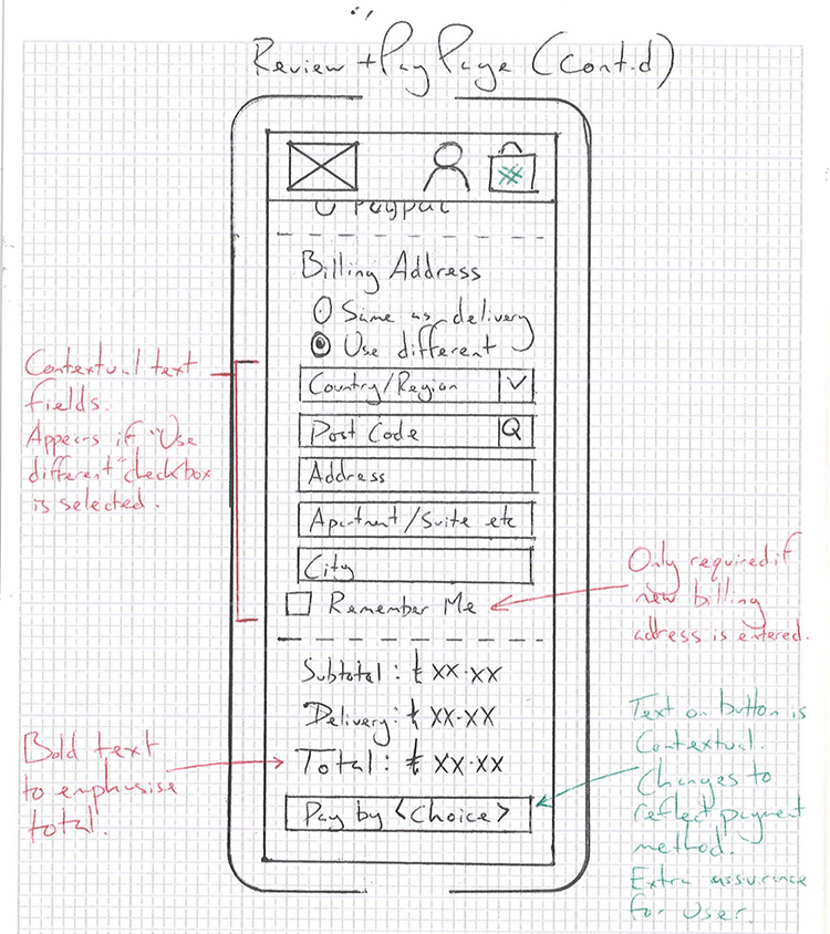
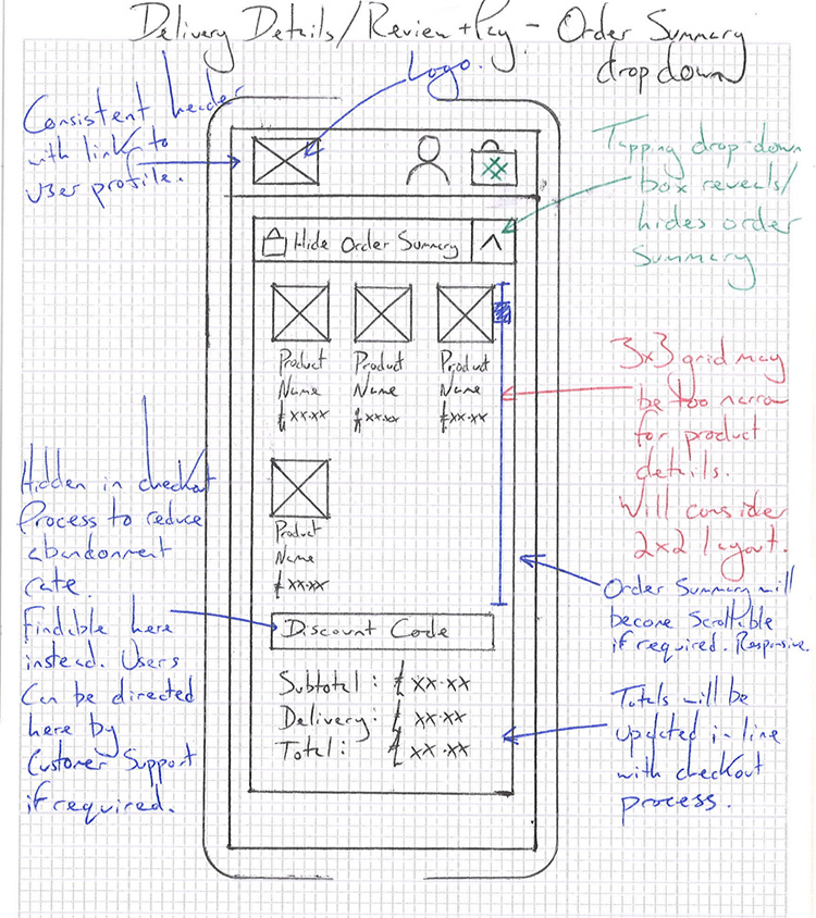
    The 19 product list pages were condensed into one ‘Shop Beers’ experience: a one-stop shop for searching, browsing, and adding beers to the user’s cart. The checkout process was split into two categories: “Delivery Details” and “Review and Pay.” Duplicate data entry requests were removed.

    Site Structure Diagram of the Sober Sauce Website

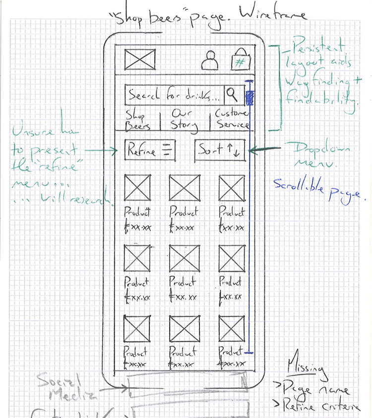
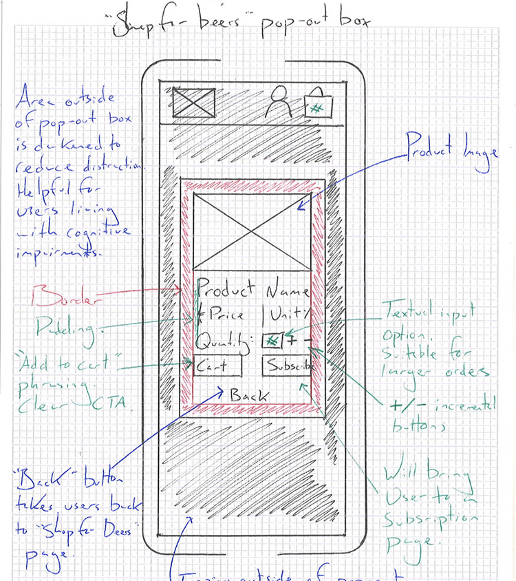
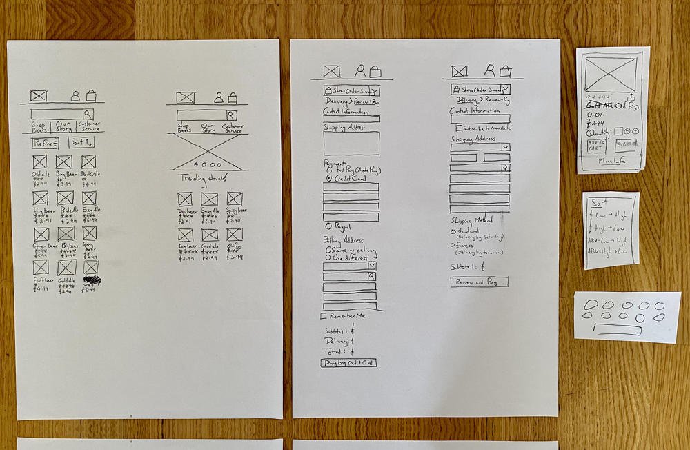
    Ideation & Low-Fidelity Wireframing

    A popover contextual menu would present glanceable product information.

    The popover system would be visible when a product image was tapped. It would provide product information, a field to purchase specific quantities, and an 'add to basket' call to action.

    The homepage and ‘Shop Beers’ page were redesigned to promote popular products and implement 'sort' and 'filter' functionality.
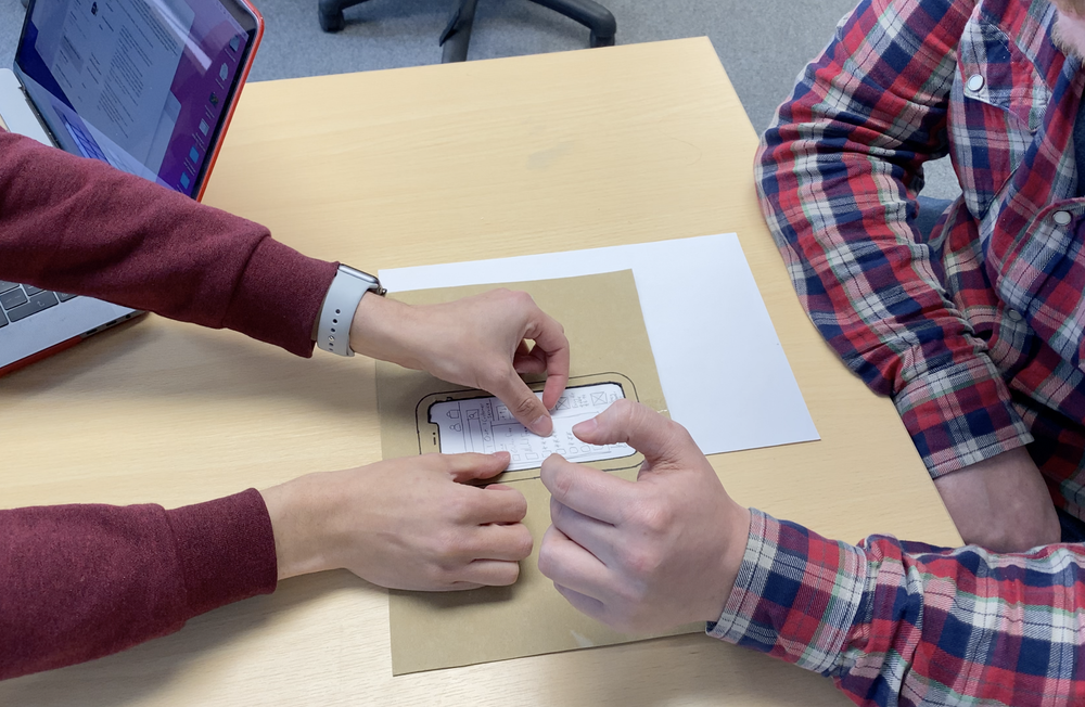
    Sober Sauce Redesign Sketches
    Sober Sauce Wireframe 1
    Sober Sauce Wireframe 2
    Sober Sauce Wireframe 3
    Sober Sauce Wireframe 4
    Sober Sauce Wireframe 5
    Sober Sauce Wireframe 6

    Usability Testing

    Users stopped reporting feelings of confusion when finding products or checking out.

    Usability testing with 'think-aloud' protocols revealed that users instinctively used searchability functions. Further feedback requested auto-complete search functionality, owing to 'creative naming’, which makes drink names challenging to remember.

    Usability Testing
    Usability Testing Artifact

    Final Design Highlights and Lessons Learned

    Homepage and 'Shop Beers'

  • A new 'Trending Beers' section on the homepage provides quick access to popular products.
  • Searchability improved by including ‘auto-complete’ search functionality.
  • ‘Sort’ and ‘Filter’ drop-down menus enable use of product categorisation properties.
  • Branding guidelines required minimal tweaks to remain in line with WCAG-AA guidelines. Background colour contrast and text size were the main factors.
  • Product Pages

  • Popover product information provides glanceable product information without requiring navigation from the results screen.
  • Branding guidelines adjusted marginally to maintain compliance with WCAG-AA guidelines.
  • Review, Payment, and Delivery Screens

  • Unnecessary webpages removed
  • Input fields are grouped to reduce the need for data entry duplication.
  • A breadcrumb trail is introduced to demonstrate checkout progress.
  • Final design screens

    A screenshot of the Sober Sauce redesign in Adobe XD